What I Do on the Daily
According to the State of Alaska, I am classified as a Publications Specialist. To skip all boring narrative, I am a web and publications designer for the Alaska State Libraries, Archives, and Museums. To sum it up more, I design and maintain the webpages for my division. Additionally, I create promotional print materials for the entire division, too. It's a lot for one person, but it keeps my job interesting!
What Needed to Happen
A new webpage was requested to advertise the upcoming events for the Alaska State Museum. I was presented with a design that needed to be translated to an online format.
Designing and Developing a Static, Yet Beautiful Page
Tooling
My considerations for tooling happened during the development process. As I worked through various steps, I opened up each applications, as needed. Here's what I ended up using:
- Acrobat Pro DC
- Colour Contrast Analyser
- Text Editor (VS Code and Dreamweaver)
- Calculator
- CodePen
- Photoshop CC
Process
As with any undertaking, the first step is to gather all your content and assets. In this case, I received a PDF file with the desired design and mandatory content.
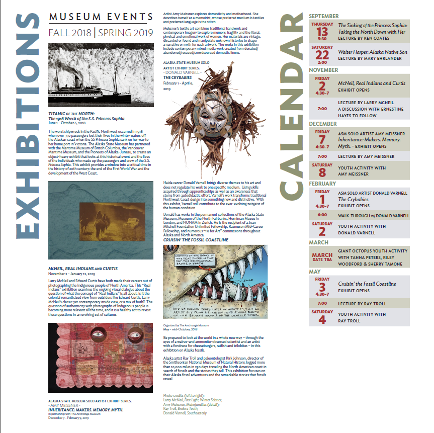
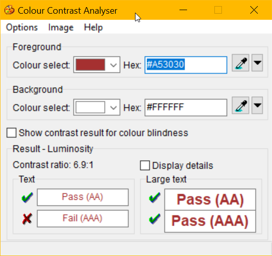
Next, I fired up Photoshop and set to work on creating this within our State's mandated look and feel to see if her design would fit within the dimensions I had to work with, as well as comparing her color palette with the website palette. I used the Colour Contrast Analyser tool to capture the colors she used, and checked for color contrast in terms of accessibility.
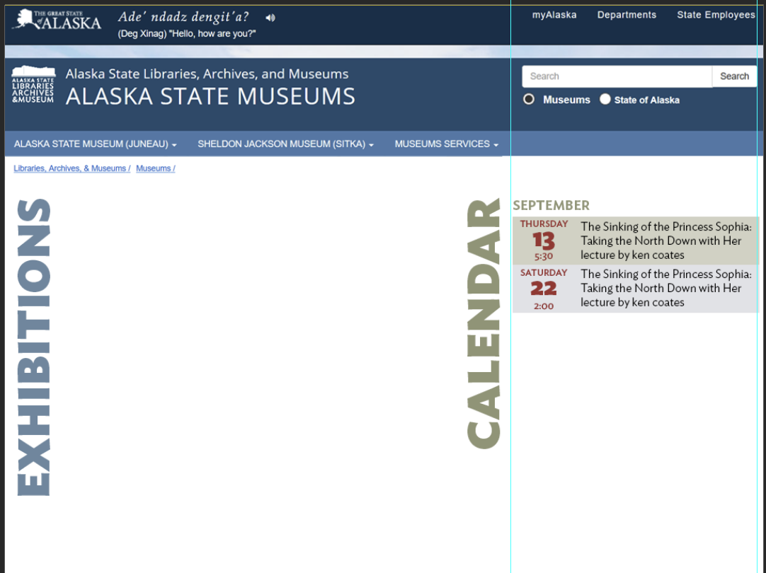
Beginning with the desktop version (not mobile-first, but I'm focused on her initial design to start), I began creating the various components that comprised this design.
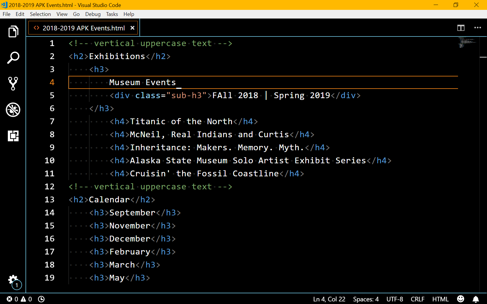
In the middle of mimicking her design, the wheels in my head started to turn. I needed to start considering the semantic layout of this page and how I could implement those styles. This could, in turn, determine if I needed to make any design tweaks myself.
At this point, I feel like I should note... this is EXACTLY why I like having three screens at my workstation.
As I coded things out, there were a few design challenges, like the vertical text (thank you, writing-mode!), that I needed to work through. Enter CodePen:
https://codepen.io/digilou/pen/aRzzpK
After getting most of the structure, style, and content in place, I worked in Photoshop to make the required images ready for the web and our rural user base. Considering the design and the purpose, I went the simple route by choosing only one image size and one image format for each.
By the end of the project, I had refactored my CSS to be a bit more modular, scalable, yet unique as I prepared to insert it into the custom stylesheet I had for the entire site. I also had to come up with some IE 11 hacks to let my grid choices remain:
@media screen and (-ms-high-contrast: active), (-ms-high-contrast: none) { .text-vertical { transform: rotate(0); text-align: left; } .grid-calendar li { display: flex; } .event-datetime { min-width: 5em; } }
Alas, I gave up searching for a column-count resolution. It isn't working in IE, but I take some comforting in knowing IE design ultimately cannot be exactly the same experience as Firefox and Chrome, though many days I have sweated over it.
A Polished Product, 14 Hours (across 6 days) Later
How did it all turn out, you ask? Here's a screenshot from my desktop Firefox view (my preferred personal and professional browser):
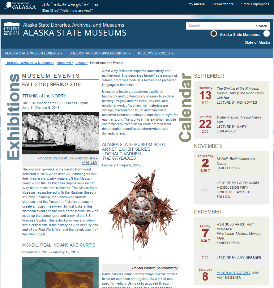
Alaska State Museums: Exhibits and Events
My day-to-day work and processes vary. And I get interrupted... a lot.
I wanted to share this design and development process, in particular, with you because it was one of the few times I felt on top of it, confident in what I was doing, while committing and embracing the time I needed to complete it.
What Needs to Improve
Workflow
Always do I feel like I could improve my workflow alone. Though most projects feel like a one-off, I can't help but think my stylesheets could be organized different or scale better. And, really, someday I would like to learn and implement BEM, but this just wasn't the time for it.
Also, I haven't committed the time to set up automated tasks (Gulp, Grunt, etc.), which could save me time when it comes to image and stylesheet management. Images are such a vital, lush part of the web, but the current trend reveals that mobile use has risen beyond the point of being ignored. And the State of Alaska cannot deny all the rural users with limited connectivity and Internet plans, so images must be optimized in order to serve our entire population.
Teamwork
My co-worker (and fabulous graphic designer) for our museum exhibits was more than willing to help in any capacity to move this project along. After I felt my way through this, as I often do, it occurred to me that I could've saved myself some time by asking for the specific design specs and individual image assets up front, rather than finding these things on my own. Or, even better, she would have been happy to include a Photoshop mock of what could work on the web, so I could spend more time contemplating boxes and semantics.
What I Gained
No project is complete without the lessons that come along with it:
- I learned to use writing-mode, implemented grid in a useful way, found IE11 fallbacks for these "problem" properties.
- I put HTML structuring to the test to ensure the content made sense semantically.
- I was reminded that color is fantastic for making a page more interesting, and it doesn't have to come at the cost of accessibility.
- I gained confidence for the next queued up project, and received that satisfaction that I am becoming a better front-end developer.
Today is a day I can take a moment to be grateful for the work I enjoy doing. By the afternoon, I'll be immersed in the next project (or two) to carry my work forward.